10 Easy Steps to Create a Scatter Plot in R
The ten most common and easiest steps to create intuitive and beautiful scatter plots in the R. The ggplot2 library is part and parcel of exploratory data analysis in data science and analytics.
Here are the steps:
1. Load data set and view the data structure
2. Install ggplot2 package/library
3. Load ggplot2 package/library
4. Creating a chart with data points (geom_point)
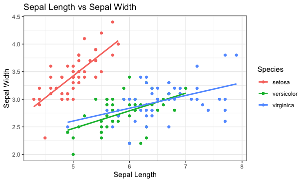
5. Adding a color based on Species (grouping)
6. Changing the canvas theme (clean/black-white)
7. Adding a title in the chart
8. Changing X and Y axis labels
9. Adding regression line for each Species
10. Removing standard error shadows (se = FALSE) around the lines
This simple and easy-to-follow video explains the ten most useful ggplot2 functions in R.
The most useful functions to creating scatter plots are:
- install.packages()
- library()
- geom_point()
- theme_bw()
- ggtitle()
- xlab()
- ylab()
- geom_smooth()
- geom_smooth(method=lm)
- geom_smooth(method=lm, se=FALSE)
